Scenic Design: Revisiting Early Work
A Retrospective, of Sorts
Recently, I went digging through my archives and rediscovered drawings, paint elevations, drafting, and production photographs from some of my earliest scenic designs. Some I hadn't looked at in decades.
Although my professional career has focused primarily on lighting design, I began designing scenery in high school. My choir teacher, a talented scenic painter, became an important mentor, while his partner, a professor at a nearby university, introduced me to theatrical lighting. Both were instrumental in shaping my early understanding of theatre and eventually inspired me to become an educator myself.
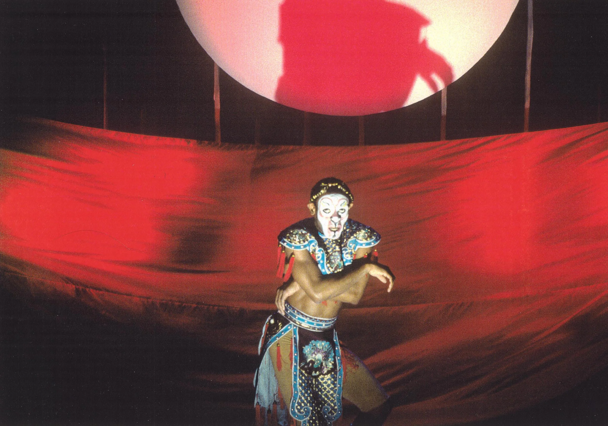
A Midsummer Night's Dream — Scenic and Lighting Design, Blue Heron Arts Center, NYC, 1999
During my late teens and early twenties, I designed scenery for several ambitious high school productions and, later, a handful of Off-Off-Broadway productions in New York City. Revisiting four of those projects has been a fascinating experience, revealing both the beginnings of my aesthetic interests and how differently I might approach some of these ideas today.
Annie
Blue Springs South High School | 1994
I was eighteen years old and had just begun my undergraduate studies when a former high school drama teacher hired me to design the scenery for Annie. I was still largely self-taught, having learned from design books, conversations with mentors, and whatever practical experience I could find.
I designed the entire production, supervised construction, and painted much of the scenery myself. I remember enjoying scenic painting enormously, and it's something I haven't done in years.
One of the major scenic elements was a full-stage backdrop inspired by the cover of a Broadway songs compilation CD. I adapted the artwork into a stylized cityscape, incorporating translucent areas in the sky and white architectural bands. For the realized drop, I used aniline dyes to spray the sky and left the white areas unpainted, allowing them to glow vividly when backlit.
Annie (1994) - Paint Elevation - NYC Drop
Annie (1994) - Paint Elevation - NYC Hanger
At the time, I was also quite taken with the visual style of the 1990 film Dick Tracy. Its bold colors, graphic architecture, and comic-strip aesthetic influenced a scenic hanger I designed for the "N.Y.C." number. The unit included functioning center doors, which I learned the hard way needed safety latches to keep them closed when the scenery was flown.
Warbucks's mansion took another approach to the graphic imagery I was exploring. I developed a money motif, using chrome oxide green as a dominant base color, with beige and gold architectural details throughout. Most of the molding was painted rather than constructed dimensionally, reinforcing the two-dimensional comic-strip inspiration. Looking back, I also suspect I didn't entirely understand architectural molding at the time!
Annie (1994) - Paint Elevation - Mansion Back Wall
Annie (1994) - Mansion Railing Detail Sketch
The mansion's main scenic unit was an enormous raised platform with a central staircase. I designed a railing incorporating dollar-sign profiles to be cut from three-quarter-inch plywood and painted with gold Rosco scenic paint. One of the students' fathers volunteered to cut the shapes with a basic jigsaw. I imagine he was cursing my name by the time he finished, but I recall the result being quite successful.
With the rediscovery of these materials, I decided to reconstruct some of the scenery as 3D models in Vectorworks. I used the original drawings and scans of my thirty-year-old paint elevations, along with digital image tools, to develop renderings suggesting what these scenes might have looked like.
Looking back, I'm rather impressed by the ambition of my eighteen-year-old self, but there are certainly things I would reconsider today.
I remember the mansion wagon being enormously cumbersome and difficult to move. More importantly, much of the scenery seems designed to create attractive pictures rather than actively support the performers and action of the play. I hadn't yet learned to fully consider blocking, movement, and the practical needs of storytelling. For example, my original orphanage design included only two beds. The director wanted a bed for every orphan, and we ultimately found a way to accommodate them.
There are also conflicts in the visual language. The Dick Tracy-inspired NYC hanger doesn't quite belong to the same world as the backdrop. I had plenty of visual inspirations but hadn't yet learned how to bring them together into a cohesive design.
If I were approaching Annie today, I would absolutely want to revisit that comic-strip aesthetic but explore how it might become a consistent visual language throughout the production. How could two-dimensional imagery interact with dimensional scenery, lighting, and perhaps projection? How might that graphic style better support the storytelling?
Annie (1994) - Mansion Rendering
Annie (1994) - “NYC” Rendering
Whatever its shortcomings, I was delighted to rediscover this work and rather amazed that I managed to pull it off. Apparently the school was pleased too, because I was hired again the following year.
Hello, Dolly!
Blue Springs South High School | 1995
Unfortunately, considerably less material survives from my second production at Blue Springs South High School. I found a packet of blue-line drafting, but none of the color elevations or paintings. I know I designed and painted at least two full-stage drops, but that artwork seems to have disappeared.
What remains reminds me just how ambitious the project was.
Hello, Dolly! (1995) — Elevation - False Proscenium
For Hello, Dolly!, I designed an entirely new proscenium environment downstage of the theatre's existing architecture. I suspect I had been inspired by the elaborate scenic environments of large British musical productions of the period, particularly those produced by Cameron Mackintosh. Transforming a high school auditorium into something grander seemed appropriate for Dolly, especially with the opulent world of the Harmonia Gardens restaurant. Though I'm not sure I even knew the word "opulent" at nineteen!
The proscenium was a substantial construction project, with dimensional molding, dentil details across the top, decorative doorways, and valance drapery. Apparently I'd learned a little more about architectural molding since Annie!
I recall we also constructed a passerelle around the orchestra pit, extending the playing space into the audience area, although I haven't found that portion of the design in the surviving drafting.
One of the painted backdrops was an in-one drop, allowing scenes to play downstage while larger scenic units were struck or reset behind it. It's a familiar musical theatre convention, but I'm rather impressed that I understood and employed it at nineteen. I also remember designing the artwork to fit neatly within the proscenium's molding and drapery.
For the hat shop, I designed a central revolving unit that transitioned from the exterior to the interior. Once turned, it joined adjacent stage-left and stage-right wagons to complete the shop.
Hello, Dolly! (1995) — Elevation - Proscenium Torms
Hello, Dolly! (1995) — Ground Plan - Hat Shop
I wish I had more visual documentation of this production. Somewhere there was once a photograph of me standing beside the completed proscenium, but I haven't been able to locate it. This was long before everything was digital, and I didn't yet appreciate the importance of archiving my work.
Looking through the drafting today, I'm intrigued by my early interest in scenic transformation and the architecture of the theatre itself. The proscenium and passerelle changed the character of the performance space, while the rotating hat shop and in-one drop addressed the mechanics of theatrical storytelling. I'd be interested in exploring those ideas again, particularly how architecture and scenic transformation can become expressive elements of a production rather than simply its physical framework.
A Midsummer Night's Dream
Blue Heron Arts Center, New York City | 1999
My first professional work in New York City came through Yangtze Repertory Company, founded by Sister Joanna Chan, a remarkable director and playwright who was also a Maryknoll sister and worked with incarcerated people at Sing Sing Correctional Facility.
In 1998, I designed lighting for Yangtze's The Life and Times of Ng Chung Yin, a production about a Chinese revolutionary. For a twenty-two-year-old designer from the Midwest, newly arrived in New York, it was an extraordinary cultural awakening that significantly expanded my understanding of the world.
I believe it was actor Lu Yu, whom I met through Yangtze, that brought me into A Midsummer Night's Dream at the Blue Heron Arts Center, where I designed both scenery and lighting.
The production featured a multicultural cast and a distinctly Chinese-influenced visual concept. My design was relatively simple, relying on a few strong scenic images and their interaction with lighting.
A Midsummer Night’s Dream (1999) — Archival Photo
A Midsummer Night’s Dream (1999) — Archival Photo
A simple black-and-white backdrop was painted directly onto black duvetyne. Above the playing space, I suspended a large circular moon, echoed by a corresponding image painted on the stage floor. Lighting transformed the moon throughout the production, including shadow effects and the projection of the Chinese character for "dream."
A Midsummer Night’s Dream (1999) — Archival Photo
A Midsummer Night’s Dream (1999) — Archival Photo
I still find the simplicity of this design appealing. A limited number of scenic elements established a visual world that could change through light.
At the same time, I wish I could return to the production with a deeper understanding of its visual and cultural influences. I don't remember all the reasoning behind the original design choices or precisely how the Chinese visual concept developed. Today, I would want to spend more time researching the artistic traditions behind those images, particularly Chinese landscape painting, its approaches to space and composition, and the symbolism of the moon in Chinese art and poetry. I would also seek out collaborators who could bring additional cultural and artistic perspectives to the process.
I'm also intrigued by how contemporary technology might intersect with those traditional visual ideas. Pipilotti Rist's Pixel Forest, an immersive installation of thousands of suspended LED lights, suggests an entirely different way of creating a forest through light and color rather than physical scenery. Could the imagery and spatial composition of Chinese landscape painting coexist with a luminous, pixel-based environment? I'd love to explore how these seemingly different approaches might come together to create the otherworldly realm of Midsummer.
I would love to sink my teeth into Midsummer again, not necessarily to reproduce this earlier concept, but to explore its possibilities through deeper research, experimentation, and collaboration.
Pipilotti Rist, Pixel Forest (2016). Photo: Maris Hutchinson / EPW Studio. Courtesy of the New Museum, Pipilotti Rist, Hauser & Wirth, and Luhring Augustine. Via Vogue.
Othello
Africa Arts Theatre, New York City | 2003
By 2003, my professional work was increasingly focused on lighting, but I was still looking for opportunities to design scenery. Othello, produced by Africa Arts Theatre Company, gave me another chance to combine both disciplines.
The production took place in a particularly unusual venue: a small theatre carved out of the former Show World Center, an adult entertainment establishment in New York City. The conversion was, shall we say, incomplete. Remnants of the space's previous life remained, including stripper poles in the lobby and a distinctive fixture with red light bulbs visible in the production photographs. I suspect we simply weren't permitted to remove it.
Othello (2003) — Archival Photo
I designed a series of burlap-covered hinged panels attached to the side walls. These could open and close, altering the shape of the playing space and revealing or concealing areas just outside the central action. Under certain lighting conditions, the burlap also produced a scrim-like effect, allowing performers to be partially visible behind the panels.
Fragmented architectural arches suggested a more substantial environment without fully enclosing the space. A painted floor helped define its visual composition, much as the reflected moon had done in Midsummer several years earlier.
Othello (2003) — Archival Photo
The theatre itself was a small, shoebox-shaped space with a low grid and limited scenic possibilities.
Much of the scenery was constructed in the theatre over a relatively short period. I also sourced materials through Materials for the Arts, New York City's creative reuse program. I remember dyeing some of the free fabric in the bathtub of my New York apartment.
My central challenge was finding a way to make this confined space accommodate the many locations of Othello.
Othello (2003) — Archival Photo
Recently, I also rediscovered photographs of the original scenic model and a scene-by-scene document containing ground plans and model views. Combined with the surviving production photographs, these offer an opportunity to see how the design transformed throughout the play, from the original model to its realization onstage.
I've long been fascinated by scenic devices that can transform a space—portals, sliding panels, architectural surrounds, and other elements that conceal or reveal what lies beyond them. Othello was an early attempt to explore those interests within severe spatial and financial limitations.
I would love to investigate the design in a larger theatre, where the fragmented arches could become more substantial architectural elements, perhaps moving or changing configuration as the action unfolds.
I'm particularly interested in revisiting the burlap panels. Their texture and partial translucency suggest possibilities for lighting and projected imagery that I couldn't fully explore at the time. I can imagine expanding them into a more complete scenic surround, with sections that open and close to reveal performers or additional playing spaces. The same surfaces might receive projections, while variations in lighting could alternately emphasize their texture, reveal what lies behind them, or make them appear more solid.
What interests me is how these physical materials, architectural elements, lighting, and imagery might work together to create an environment that can continually transform, even when relatively little scenery physically moves.
The original production was modest in scale, but some of its underlying ideas still resonate strongly with the work I'm interested in pursuing today.
Looking Forward
Rediscovering these projects has been an unexpectedly rewarding experience. I'm struck by the continuity of certain interests across the years: graphic imagery, architectural transformation, painted surfaces, and the ways lighting can alter our perception of space.
Although my professional practice has centered on lighting, my work has increasingly involved projection, video, and media, bringing me back to many of the ideas that first attracted me to scenic design. I've long been inspired by Robert Edmond Jones's vision of the possibilities that might emerge from merging cinema with live theatre. What was once a speculative idea is now a reality in many forms, yet I believe there's still enormous potential to explore.
I'm particularly excited by opportunities to bring scenery, lighting, video, and pixel-based technologies together, not as separate design elements, but as interconnected parts of a theatrical environment. Years of collaboration across design disciplines have taught me how much can emerge when those boundaries become more fluid.
I appreciate these early scenic designs for what they were, shaped by the circumstances of each production and the artist I was at the time. Revisiting them has helped me recognize ideas that have continued to evolve throughout my career. I'm curious to see where those ideas might lead next.